What are bleed and crop marks?
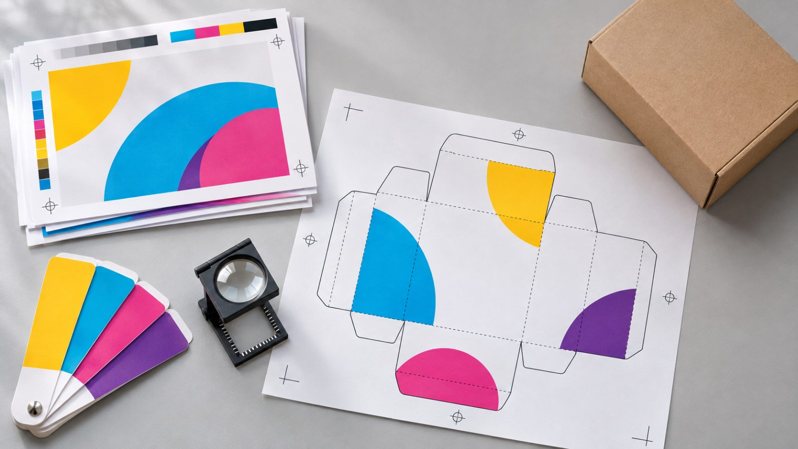
A cutter never trims exactly on the line. That is why, if a color or photo runs to the edge of the piece, it has to extend a few millimeters past the final size. That extra area is the bleed. Without it, any slight shift leaves a thin white line at the edge.
Crop marks show where the paper will be cut. Programs like InDesign let you set the document bleed and export the PDF with printer’s marks (Adobe). The exact bleed size is set by each printer, so ask for it before you build the file.
There is also a safety margin on the inside: important text and logos should not sit right against the trim edge.
CMYK or RGB?
Screens display color with light (RGB). Four-color process printing mixes four inks: cyan, magenta, yellow, and black (CMYK). Some highly saturated colors you see on screen cannot be reproduced with ink, especially certain bright greens, blues, and oranges (Adobe).
That is why it pays to design print pieces with CMYK in mind from the start, or to convert using the color profile your printer specifies (Adobe). Switching modes at the last minute can make colors look dull.
A common detail: small black text should be pure black (K only), not a mix of all four inks, so no colored fringes appear if registration is slightly off.
When should you use Pantone?
Pantone is a spot color system: each color is printed with an ink mixed for that specific shade instead of combining the four process inks (Pantone). It is used when a brand color has to look the same across materials and print runs, on packaging, on corporate stationery, or when a shade is hard to achieve in CMYK.
Keep in mind that the same Pantone looks different on coated and uncoated paper, which is why the guides come in separate versions. If your brand guidelines specify a Pantone, note which one and which version in the file, and do not convert it to CMYK without checking with your printer.
What resolution should images have?
Resolution is measured at the final print size, not in the original file. A photo that looks sharp in a social post can look pixelated on a poster. As a general industry reference, pieces viewed up close (brochures, labels, boxes) usually call for around 300 ppi at actual size, while large-format pieces can work with less because they are seen from a distance. Confirm the value with your supplier.
Logos, icons, and text should be vector whenever possible so they print crisp at any size.
What should you do with fonts?
If the printer opens a file without the font installed, it gets replaced with another one and the layout falls apart. There are two ways to prevent that:
- Embed the fonts in the PDF, which is standard when exporting with a print preset.
- Outline the text (convert it to paths) in finished pieces such as logos or packaging, when the printer asks for it.
Always keep an editable, non-outlined version: once text is converted to outlines, it can no longer be corrected.
What changes with packaging?
A box, label, or bag has a dieline: the flat template that shows cuts, folds, flaps, and glue areas. It comes from the printer or the packaging manufacturer, and the artwork is built on top of it. The dieline goes on a separate layer, in a clearly named spot color, and does not print.
Also check which way each panel faces once the box is assembled, that the barcode sits on a flat surface with good contrast, and that legal text is set at a readable size. Ideally, print a mockup on your office printer, cut it out, and fold it before sending the files.
How do you check the file before printing?
- Export a PDF with the preset your printer specifies (many work with PDF/X).
- Check the file with a preflight tool, such as the one in Acrobat Pro, which flags RGB images, missing fonts, or low resolution (Adobe).
- Ask for a color proof or press proof for pieces where color is critical.
- Approve the final proof in writing.
At AiDo Creative, as set out in the proposal, we deliver files prepared for the print supplier you choose, to their specifications.
In short
- Add bleed, crop marks, and a safety margin to your printer’s specs.
- Design in CMYK or define your Pantone colors from the start.
- Use images with enough resolution at final size, and vectors for logos and text.
- Preflight the PDF, build packaging on the dieline, and ask for a color proof.
Frequently asked questions
Can I send a Canva or Word file to the printer?
Some printers accept them, but they often cause issues with color, bleed, and fonts. The safest option is a print-ready PDF built to the supplier’s specs.
Why doesn’t the printed color match my screen?
Because a screen emits light and paper reflects it, and because every paper stock and press reproduces color a little differently. A color proof exists precisely to validate the result before the full run.
Who gives me the dieline for a box?
Usually the printer or the packaging manufacturer, based on the style and dimensions. Ask for it before you design so you don’t have to rebuild the artwork.
Which files should I keep after printing?
The editable file, the final PDF you sent, and the approved proof. That way you can reprint the same piece later or with another supplier.
Answers from the AiDo Creative teamDigital and print graphic design
Social media content, packaging, signage and print materials.
View the service