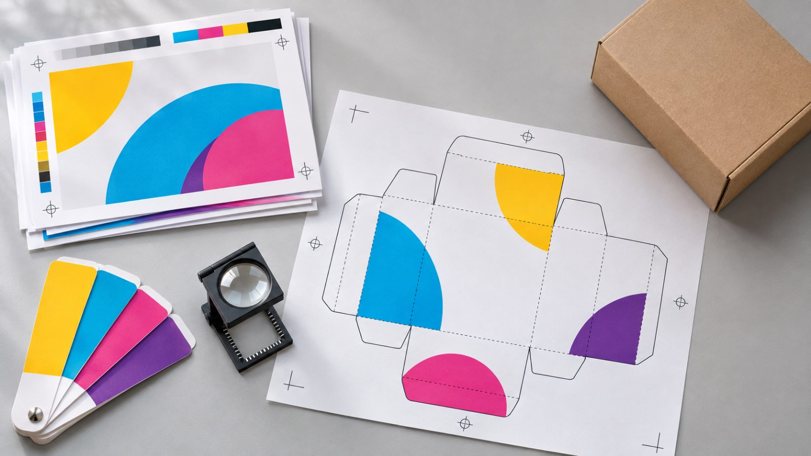
What is a brand guide for?
Consistency is what makes people recognize you. If your customers see the same colors, the same typography and the same tone on your website, your social media and your sales proposal, they associate that experience with your business faster.
Some research tries to measure the effect. Surveys of marketing leaders by Lucidpress (now Marq) report that consistent brand presentation is associated with revenue increases of 10% to 20% in most cases (Lucidpress, The State of Brand Consistency). These figures are self-reported by the respondents rather than the result of an experiment, so treat them as a signal, not a promise.
The most immediate benefit is practical: less back and forth, fewer pieces redone and less time explaining the same thing to every vendor.
Brand identity, brand guidelines and style guide: what’s the difference?
People use these terms interchangeably, but they mean different things. Brand identity is the system itself: logo, colors, typefaces and imagery. A brand guide (also called a brand manual, brand book or brand standards guide) is the document that explains how to use that system. A style guide is usually one part of it, focused on a specific use such as writing or the website.
| Term | What it is | Example |
|---|---|---|
| Brand identity | The set of elements that make the brand recognizable | Logo, palette, typefaces, icons |
| Brand guide or brand guidelines | The document with the rules for using that identity | A PDF showing correct and incorrect logo use |
| Style guide | Rules for one specific use | How the brand writes on social media, or how website buttons look |
When a printer or an agency asks for your “brand guidelines”, they almost always mean the full brand guide.
What should it include?
Complete brand guidelines usually cover eight sections. Use this list as a checklist before you sign off on yours:
- Brand essence: purpose, values and who the brand speaks to.
- Logo usage: versions, clear space, minimum size and what not to do.
- Color palette: HEX, RGB and CMYK codes, plus approved combinations.
- Typography: typefaces, weights and the hierarchy for headings and body text.
- Imagery: photo, illustration and icon style, with examples.
- Tone of voice: how the brand writes and the words it avoids.
- Accessibility: contrast rules and minimum text sizes.
- Applications: templates and real examples for social media, the website, documents and print.
The table below explains what each section defines.
| Section | What it defines |
|---|---|
| Essence | Purpose, values and who the brand speaks to, in a few lines |
| Logo | Versions (primary, horizontal, icon), clear space, minimum size and incorrect uses |
| Color | Palette with HEX, RGB and CMYK codes, and which combinations have good contrast |
| Typography | Typefaces, allowed weights and hierarchy for headings and body text |
| Imagery | Style of photos, illustrations and icons, with do and don’t examples |
| Tone of voice | How the brand writes, the words it uses and the ones it avoids |
| Applications | Examples on social media, the website, stationery, presentations and signage |
Why include contrast rules?
Brand colors also have to work for people with low vision or who read on a screen in bright sunlight. The W3C’s WCAG guidelines call for a contrast ratio of at least 4.5 to 1 for normal text and 3 to 1 for large text (W3C). A good brand guide specifies which text color goes on each background color, so nobody has to guess.
Who uses the guide?
- Your team, for presentations, emails and documents.
- External designers and agencies, for campaigns and social media.
- Print shops and signage vendors, who need the exact color codes.
- Developers, who bring the colors and typography to the website.
That’s why it’s best to deliver it in two formats: an easy-to-share PDF and a folder with the logo files in all their versions (SVG, PNG and PDF).
How do you create a brand guide, step by step?
- Gather what already exists: logo, social posts, presentations and the website. You will see what repeats and what is inconsistent.
- Define the essence: who the brand speaks to, what sets it apart and how it wants to sound.
- Organize the visual system: logo versions, palette with its codes, typefaces and image style.
- Write the rules with examples: each rule with one case to follow and one to avoid.
- Test the guide on real pieces, such as a post, a presentation and a web page, and adjust whatever does not work.
- Deliver it as a PDF together with the logo files, and decide who will keep it up to date.
For a small business, 15 to 30 pages is usually enough. What matters most is that it answers the questions that come up day to day.
When should it be updated?
When you change your logo or positioning, when you add a new channel (for example, video or an app) or when you notice pieces being made outside the rules because the guide doesn’t cover those cases. A living guide gets reviewed once a year.
Brand identity guidelines: the minimum version for a small business
Many people search for “brand identity guidelines” when what they need is a short document they can send to a printer or a freelancer tomorrow. If you’re starting out, a two- or three-page version is enough, as long as it answers the questions vendors ask most often:
- Which logo file to use on a light background and which on a dark one.
- The exact color codes, so no one has to pick them by eye from a screenshot.
- The typefaces, with a link to download them and a free alternative if they are paid fonts.
- Three or four sentences that show how the brand writes.
- One or two examples applied: a social post and a business card, for instance.
That short version already prevents the most common problems: stretched logos, colors that change from one piece to the next and posts that don’t sound like the same business. As the brand grows, the guide grows with it: you add applications, imagery rules and templates.
Brand guidelines examples worth studying
Looking at how other organizations document their brand helps you decide what yours needs. Three public examples show very different approaches:
- NASA Graphics Standards Manual (1975): the classic example of a visual identity manual. It sets out in detail how the logo, typography and layouts are applied across very different surfaces, from stationery to vehicles.
- Mailchimp Content Style Guide: a public guide focused on voice and tone. It shows that the way a brand writes can be documented with the same care as its logo (styleguide.mailchimp.com).
- Spotify design guidelines for developers: rules for third parties that show Spotify’s logo and content in their apps. A good model if other companies or partners use your brand (Spotify for Developers).
None of them is a template to copy. What they have in common is that they answer concrete questions with clear rules and examples, which is exactly what makes a guide useful day to day.
If you’d rather have someone build it with you, our branding service covers the identity and its guidelines, from the assessment to the final PDF.
In short
- The guide explains how to use the logo, colors, typography, imagery and tone.
- Consistency helps people recognize you and saves production time.
- Include contrast rules so text is easy to read.
- Update it when the brand changes or you add new channels.
Frequently asked questions
Is a brand guide the same as a visual identity?
The visual identity is the set of elements (logo, colors, typefaces). The guide is the document that explains how to use them.
Does a small business need a full brand guide?
You don't need a hundred-page document. To start, logo, colors, typography, tone and a few applied examples are enough.
How long does it take to create a brand guide?
As a general reference, documenting an identity that already exists takes a few weeks, and creating one from scratch usually takes one or two months. The timeline for each project is defined in its proposal.
Which logo format should I ask for?
Always ask for the vector version (SVG or PDF), which can be scaled up without losing quality, plus PNG for quick uses.
Does tone of voice belong in the guide?
Yes. The way your brand writes is as recognizable as its colors, and it's what gets lost most when different people do the writing.
What should brand guidelines include?
At minimum: brand essence, logo usage, color palette, typography, imagery, tone of voice, accessibility rules and applied examples. A small business can start with a short version and expand it over time.
Answers from the AiDo Creative team